Fed's New Financial Conditions Index: One Year Later...
US stocks traded mostly higher Thursday afternoon, with semiconductor shares driving the gains after strong corporate and economic news.
The S&P 500 was hovering near flatline after briefly touching a new record, the Dow Jones was up over 100 points after hitting all time high of the 43,272 mark, and the Nasdaq 100 rose 0.3%.
TSMC’s shares spiked 11%, lifting other chipmakers like AMD and Broadcom.
The tech-driven rally helped US indices approach record levels, reversing some recent market jitters over AI chip demand.
Strong retail sales data for September, showing a 0.4% rise, further bolstered sentiment.
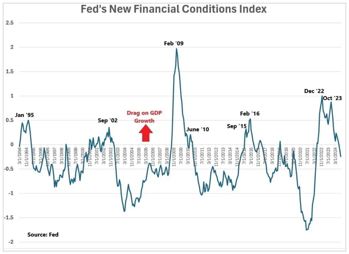
Over the past year, we've looked several times at this chart of the Fed's New Financial Conditions Index.
Remember, this index is designed to incorporate the lags of monetary policy, and project (in this case) one-year forward what the impact will be on real GDP growth.
If the line is above zero, financial conditions are expected to be a drag on growth (restrictive policy).
If it's below zero, financial conditions are expected to be a boost to growth (stimulative policy).
Also remember, each of the periods in the chart that shared the characteristic of "historically tight levels" (i.e. the peaks on the chart) were soon followed with some form of Fed easing (either rate cuts, QE, or in the case of 2015-2016 – walking back on projected rate hikes).
As you can see to the far right of the chart, one of those peaks was last October - that's when Jerome Powell signalled the end of the tightening cycle, and the Fed started telegraphing the easing cycle.
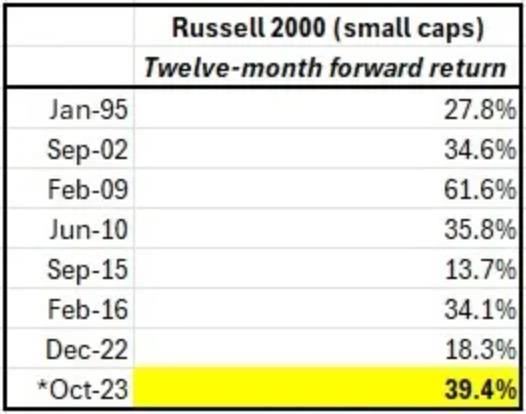
With that, back in that December 5th note we also discussed the performance of stocks following each of the turning points in the chart (the peaks). Stocks did very well in the subsequent 12-month period — and small caps outperformed.
We also discussed the performance of stocks following each of the turning points in the chart (the peaks). Stocks did very well in the subsequent 12-month period — and small caps outperformed.
Let's revisit that analysis and take an updated look at small cap performance since that October peak/turning point in the chart above.
We are now twelve months forward, and indeed the October peak in the chart was followed with Fed easing, and indeed the subsequent 12-month period was very good for stocks.
And now, as you can see to the far right of the chart above, financial conditions are now indicating stimulative to economic growth (the line is below zero on the chart).
From the Fed's index inputs, when factoring in the current Fed Funds rate, the 10-year yield, the 30-year fixed mortgage rate, the lowest investment grade corporate bond rate, the DJIA stock market index, the Zillow house price index, and the value of the dollar, the Fed’s index now projects about a quarter point boost to real GDP one-year forward.


