The second reading on Q1 GDP came in yesterday morning, the economy grew at a 6.4% annual rate.
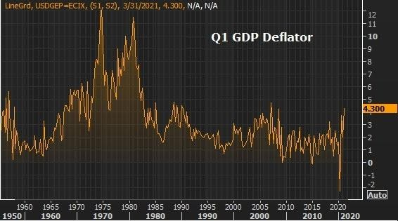
The inflation data in the report came in hotter than in the first estimate. Here's a look at the chart...
In this chart, you can see the measure of inflation in the prices of goods and services produced in the U.S. for the period. It's as hot as we've seen over the past forty years.
But when the Q2 data starts rolling in (in early July), the right side of this chart will look more like the big spikes from the early 70s and 80s. The Q2 GDP will be double-digits, or close to it (right now the Atlanta Fed is projecting 9.1% growth), and the inflation data may be double-digits, or close to it, as well.
If the Fed has had a hard time defending its position in the face of Q1 data, they will lose the inflation expectations battle when the Q2 data hits.
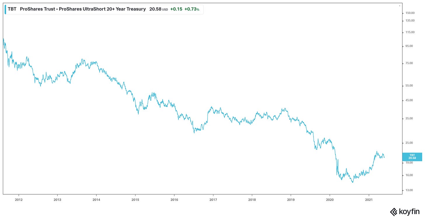
With that in mind, with only a month left in Q2, we have a 10-year yield that, as of Wednesday, was trading as low as 1.55%. It's higher now on the hotter inflation data, and this bump in yields may be the start of the next leg higher. As you can see in the chart below, big picture, we've yet to see the trend change on this 40-year bear market in rates (bull market in bonds). But when it happens it may be ugly.
How can you profit from a trend change? Below is the chart of an ETF that gives you two-times exposure to a decline in bond prices (and rise in yields). So for every one percent decline in bond prices with maturity of 20-years or more, this ETF should rise by 2%.


