Members of the Fed is beginning to telegraph a more aggressive rate path. How aggressive will they become, and will they be able to tame inflation? We will see.
If we look back to the early 80s period of high inflation, here is what stock returns looked like (the first column in the table below)...
Now, also notice the impact inflation had on the real (after adjusted for inflation) rate of return in stocks (the third column).
Through a four-year period, where inflation averaged nearly 10% per year, you can see, in the far two columns, what it looked like for those that remained invested in stocks, relative to those that went to cash.
The takeaway: Being long stocks not only gave you a hedge, but increased your buying power by 30% over the period. Going to cash, destroyed your buying power by 33% over the period.
This supports the theme we've been discussing since the onset of the pandemic response - in this environment, you have to be long asset prices.
On a related note, I want to revisit some of my analysis of the long-term path of the stock market and the long-term path of GDP. As you may recall, we've looked at these charts many times over the past years…
The growth trajectory, too, was knocked off path fifteen years ago, and because of the very sluggish recovery spanning more than a decade following the Great Recession, we are still well off the trend.
This explains the big and bold monetary and fiscal response to the Covid shutdown. It was deliberate, and it was done to inflate growth and inflate away debt (not just domestically, but globally).
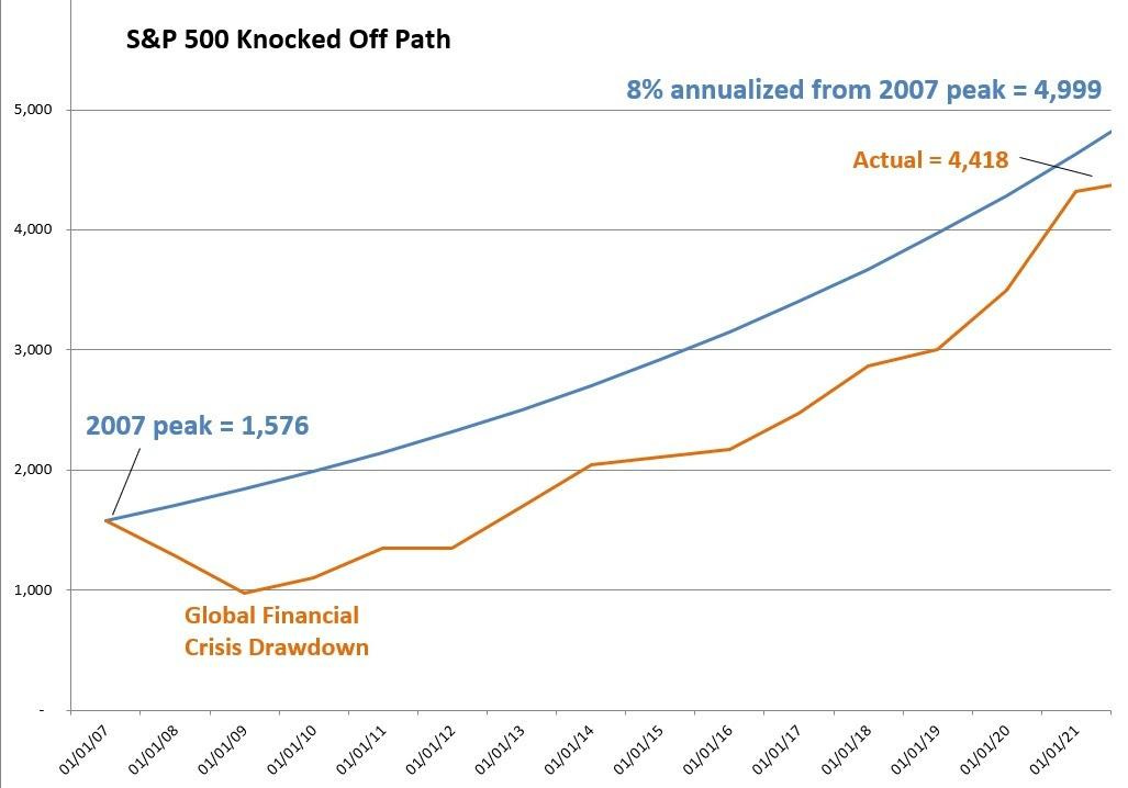
This chart shows us what it would take to put us back on the path of 8% annualised growth in the S&P 500.
The blue line represents what the S&P 500 would have looked like, had it continued to grow at its long-run annualised rate of 8%, from the 2007 pre-Great Financial Crisis peak.
The orange line is the actual path of stocks (which includes the deep financial crisis decline and the subsequent recovery).
Through the years of looking at this chart above, there has been plenty of chatter along the way about the huge performance of the stock market - plenty of bubbles and overvaluation talk. The reality is, we were knocked off of the path of the long-term trajectory of stocks (the orange line) and that path of a long-term 8% annualised appreciation has never been regained (the blue line).
What can we attribute this gap to?
Post-recession economic recoveries in stocks are typically driven by an aggressive bounce-back in growth, to return the economy to "trend growth."
We didn't get it. Instead, the post-Great Recession growth environment was dangerously shallow and slow.
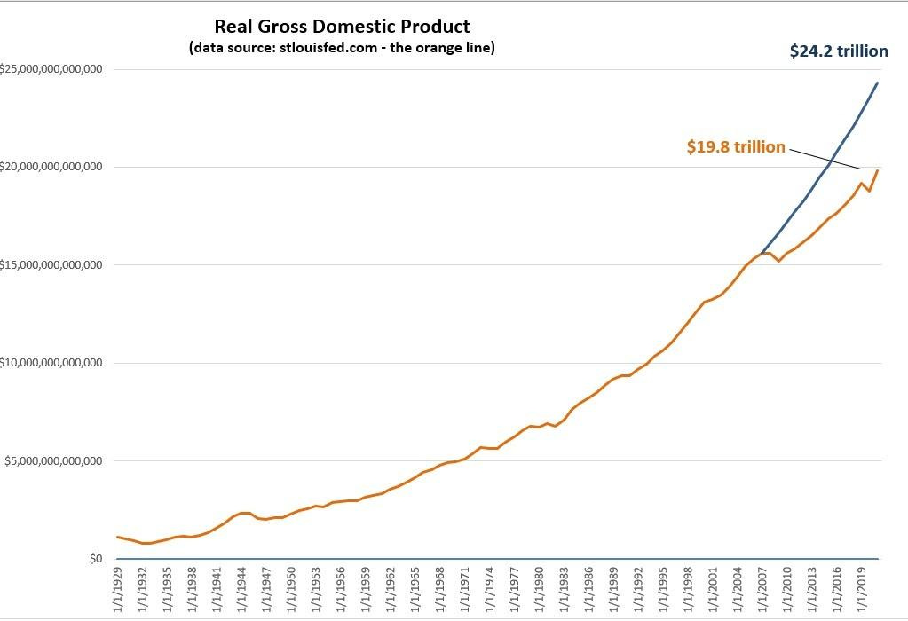
In this next chart, the blue line is the path of real GDP if it had continued growing at the long-term average rate of 3.2%, from the pre-financial crisis level. The orange line is actual real GDP.
We've seen the outcome of the policy response in stocks (and broad assets) - Values have inflated.
Importantly, the Fed has done nothing to stop the inflation - this is intentional. They told us along the way that they would let inflation sustainably overshoot their target of 2% before even thinking about removing emergency level policies.
As such, we are finally seeing the gap (between the orange line and the blue line) in stocks, close. Another 13% from current levels in the S&P 500 will put us on the path of the long-term trend.
But just as the Fed has (intentionally) let inflation overshoot, we should expect asset prices to overshoot as well. We're seeing it in some prices (some commodities, housing, used cars). For stocks, this means the orange line in the first chart (above) would shoot north of the blue line, and maybe for a considerable period of time - that would argue for new, higher highs in the broad stock market.
Now, this is where it gets, maybe, more interesting. What would it take to get GDP back to trend by the next Presidential election?
It would take 10% annualised real growth.
Sound crazy? The last time we had that kind of growth was the early 40s. - this was the economy coming out of the depression, as you can see here...
What were the drivers of 14% average annual growth over these 5 years? In part, the New Deal (government spending program), and in larger part, World War 2.
Probably no coincidence, what's a growing likelihood today? World War 3, which would be leverage for the White House to get it's Green New Deal ("Build Back Better") government spending blowout approved.
This early 40s period may be a good analogue for what's coming.


