Stress
US stocks ended mostly lower on Wednesday following higher-than-expected January CPI data.
The S&P 500 slipped 0.3%, the Dow Jones dropped 237 points, while the Nasdaq 100 gained 0.1%.
Comments from House Speaker Mike Johnson on tariff exemptions provided some support for sentiment, helping to limit broader market losses.
The 10-year Treasury yield surged to over 4.65%, leading to declines in mega-cap technology stocks like Amazon (-1.6%) and Alphabet (-0.9%).
In contrast, gains in Tesla (+2.4%), Apple (+1.8%), and Palantir (+4.2%) helped offset losses, while CVS Health surged 14.9% on a strong fourth-quarter earnings beat.
The inflation report showed an uptick in prices in the month of January. A one page summary of the report can be found here.
The monthly change in core CPI (excluding food and energy) was the hottest since April of 2023. As for headline CPI, the year-over-year change has been ticking higher every month since the Fed started its easing campaign back in September.
Does this mean the Fed made a mistake cutting rates?
Is that why the market has taken the 10-year Treasury yield (the market-determined benchmark interest rate) 100 basis point(+) higher, while over the same period the Fed has taken the Fed Funds rate 100 basis points lower
Unlikely. This divergence has more to do with the health of the U.S. government bond market, than it does inflation picture.
Keep in mind, the Fed still has the Fed Funds rate well ABOVE the rate of inflation (well over 100 basis points). That "restrictive" stance continues to put downward pressure on the economy, and downward pressure on inflation. So, the 100 basis points of rate cuts has merely reduced restriction.
As for government bond yields, remember, as we've discussed coming into the year, the exiting Treasury Secretary (Yellen) has left the incoming Treasury Secretary (Bessent) with a third of the outstanding government debt to rollover this year, while saddled with planned budget deficit spending at record peacetime levels.
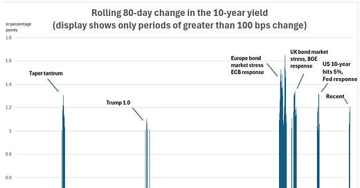
With that, let's take a look at this chart below ...
This chart dates back to 2011. The blue bars represent the rolling 80-day change in the 10-year Treasury yield when that change exceeded 100 basis points.
The bar on the far right ("recent") is the most recent episode of this rare magnitude in the rate-of-change in bond yields. And that bar denotes the sharp rise in the 10-year yield from this past September through January. The rise started when the Fed made its first (50 bps) rate cut. And it ended, topped out, just prior to the inflation report last month.
And as we discussed earlier this week, that top in yields came at 4.80%, an uncomfortable level for the Fed. With the 5% level in spitting distance (a vulnerable level for financial stability and fiscal sustainability), the tide was turned with just a slightly cooler core inflation number—but mostly from Fed officials overtly talking the interest rate market down.
With that, if we look at these other bars on the chart, we can see some commonalities with this recent episode.
Trading success depends on having an edge and the discipline to apply it. The production and dissemination of premium content to members enforces the discipline to apply the edge.
The strategies for sale are proprietary and based on sound hypotheses about price action behaviour and the formation of anomalies in short-term and longer-term timeframes.


