


Re-emerge


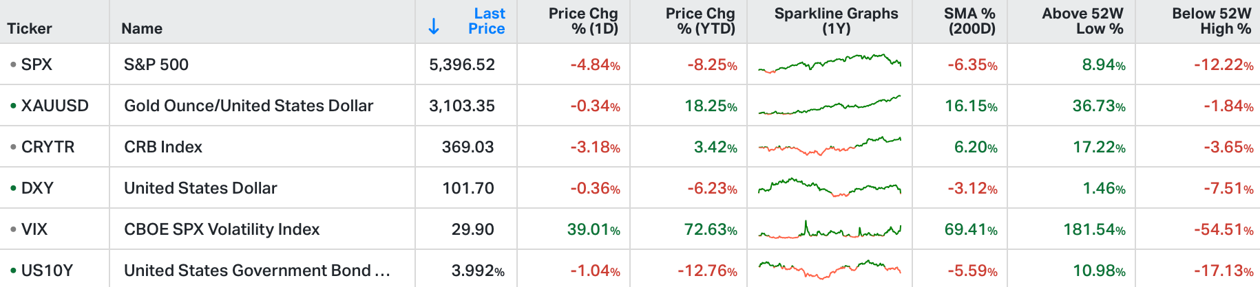
US equities faced their steepest decline in over two years on Thursday, as major stock indexes suffered sharp losses.
The S&P 500 plunged 4.8%, erasing roughly $2 trillion in market value, marking its largest drop since 2020.
Investors were rattled by the looming threat of President Trump’s new tariff plan, which could trigger global retaliation and potentially harm economic growth.
Tech stocks led the sell-off, with Apple tumbling 9% and Nvidia falling 7.8%, while major retailers such as Nike (-13%) and Dollar Tree (-13.3%) posted double-digit losses.
Despite the significant declines, traders noted that the sell-off remained orderly, though concerns over inflation and market volatility continued to mount.

With the big decline in stocks, let's take a look at the historic one-day declines of similar magnitude (or more) ...

This is the S&P 500 futures. As you can see this roughly 5% or greater decline has some rare company. Interestingly, among these severe declines is a down 5.4% day on February 5th of 2018.
While it wasn't directly attributed, at the time, to tariffs, it came just two days before the effective date of a 30% tariff on solar panels and a 20% tariff on washing machines - mostly all having to do with China.
The next day was the low of a 12% decline. That decline was from the record highs, and happened over the course of just six days. It took a little more than six months to regain new record highs.
Guess what else happened on February 5, 2018?
Jerome Powell was sworn in as the new Fed Chair.
Trump tax cuts had just been signed into law two months earlier. Just three days before Powell took the helm, a hot employment report hit, with the hottest wage growth since prior to the Global Financial Crisis. Government bond yields were already on the move (trading to the highest levels in four years, around 2.7%). And Trump had just kicked off tariffs.
From the outset of the Trump administration, the Fed viewed Trump's economic policies as inflationary and started to exit emergency-level policies of the prior eight years. They started a series of mechanical interest rate hikes.
By the time Powell became Fed Chair, they were several months into quantitative tightening. There was clear concern in markets about the potential of a misstep by an inexperienced Fed Chair, in dealing with the unknowns of quantitative tightening.
With that, we have the plunge in stocks today, of similar magnitude to this February 2018 day. And we have the "tariff" commonality. Also, like in 2018, we have plenty of Fed influence on the stock market correction.
In the current case, we have a Fed that has hit the pause button, early into the easing cycle, even as they have rates at historically restrictive levels (continuing to put downward pressure on the economy and on inflation).
Again, they've judged, based on their actions and their forecasts, that the balance of risks from the Trump policies would skew toward inflationary. But both the bond market and the stock market over the past two months seem to be telling us the Fed pause was a mistake.

As we've discussed many times in my daily notes, the turning points in markets over time tend to be determined by some form of monetary policy adjustment. You can see it in the chart, just over the past four years.
In the current case, we should expect the Fed easing cycle to re-emerge.
From our Valuation Model Series | More Information | Latest Research Roundup
U.S. Equities: Attractive Sold off Stocks
We seek out U.S. firms with a market cap over $2bn that have been sold off by 10% or more YTD, have seen improvements in PRV Fundamentals, have a Valuation score below the top quintile, and look favourable in the Valuation model framework.

The firms are spread across our PRV Heat Map, from the upper left ‘Expensive but Worth It’ zone, the upper right ‘High Quality & Cheap’ (UAL, MHO, TPH), and the bottom right ‘Attractive Value’ (SYF) zone.
The HEAT map is the visual trade-off between Quality and Valuation: companies in the favourable (blue) area offer higher quality and/or cheaper valuation than those in the unfavourable (red) area. The y-axis is our measure of Quality, where the higher the score, the higher the company’s Quality or Risk-Adjusted Profitability is. This is a composite score including Level and Trend of Profitability (P1 and P2) as well as Volatility and Vulnerability (R1 and R2). The x-axis is our measure of Valuation, which includes Wealth Ratios and Wealth Multiples (V1 and V2). This axis is plotted in reverse, so the most expensive stocks (highest V scores) are to the left and the cheapest V scores are plotted to the right.