Gap to Trend
The S&P 500 and the Nasdaq added 0.2% each to close at new record highs on Monday.
The Dow Jones 100 gained 0.1%, finishing near its record levels.
Fed official Christopher Waller stated that he needs to see several more months of favourable data before considering interest rate cuts.
Macy's shares dropped 2.4% following a decline in first-quarter sales and profits, although the results still exceeded expectations.
Peloton plunged 16.4% after announcing a “global refinancing” process, which includes a convertible notes offering and a $1 billion five-year term loan.
As we head into Nvidia earnings, let's reflect on where we were one year ago.
In May of 2023, we were two months removed from a major shock event, bank failures, and the threat of a broad run on the banking system. Regional banks were still considered "at-risk," particularly those with the combination of high uninsured deposits and large duration risk.
Meanwhile, Congress was in another standoff on the debt ceiling. The Treasury Secretary was lobbing debt-default threats (in an attempt to create negotiating leverage). More than half of Americans expected a severe recession within six months (as severe or worse than the Great Recession).
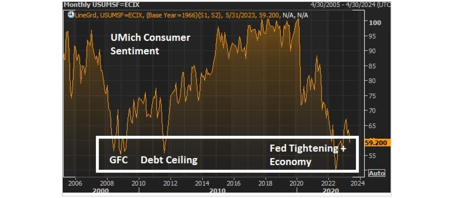
And back in May of 2023, we observed this chart on consumer sentiment - it was plunging back to levels of the Global Financial Crisis, and the 2011 debt ceiling standoff (which was also accompanied by a sovereign debt crisis in Europe).
The chart reflected despair.
It all changed on May 24th. That's when Nvidia reported earnings - the "Nvidia moment."
Jensen Huang revealed that a retooling of the world's computing technology was underway, and in the very early stages. That was the catalyst that swung the pendulum from despair to enthusiasm. The interest rate market flipped from rate cut expectations to projecting more rate hikes - as growth prospects and the economic outlook suddenly became much brighter.
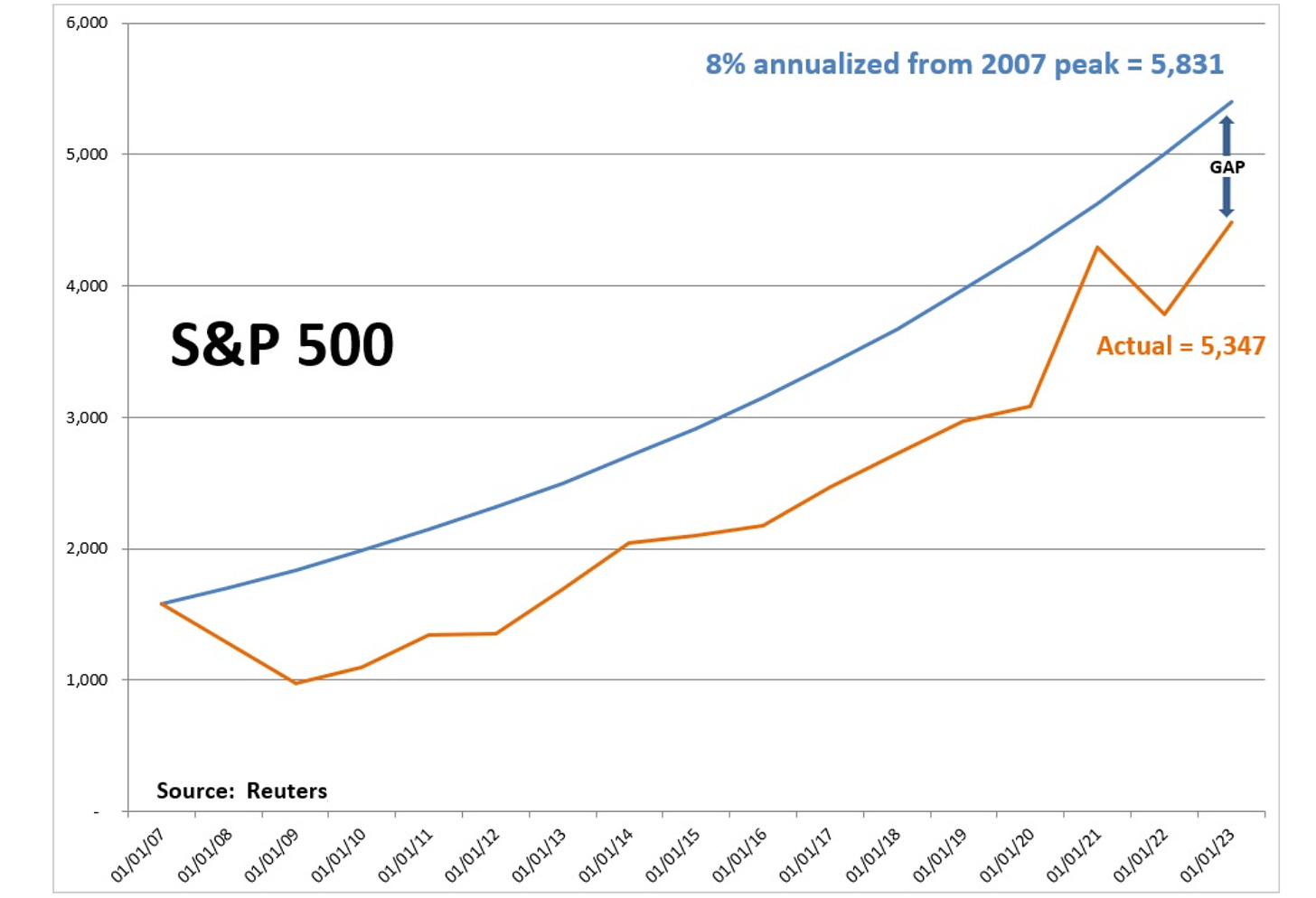
How did stocks do? The S&P 500 is up 30% from that "Nvidia moment." With that, let's revisit some of my analysis on the long-term path of the stock market …
The blue line represents what the S&P 500 would have looked like, had it continued to grow at its long-run annualised rate of 8%, from the 2007 pre-Great Financial Crisis peak. The orange line is the actual path of stocks (which includes the deep financial crisis decline and the subsequent recovery).
Through the years of looking at this chart above, there has been plenty of chatter along the way about the performance and status of the stock market - plenty of bubble and overvaluation talk. But the reality is, we were knocked off of the path of the long-term trajectory of stocks (the orange line), and that path of a long-term 8% annualised appreciation has never been regained (the blue line).
What can we attribute this gap to? Post-recession economic recoveries in stocks are typically driven by an aggressive bounce-back in growth, to return the economy to "trend growth." We didn't get it in the post-great recession era. Growth was dangerously shallow and slow. Deflationary pressures persisted.
However, the pandemic fiscal response, unlike the great recession fiscal response, put cash in the hands of consumers - you can see what the short-lived boom-period did to close that gap in the chart (the orange line converging to the blue line).
However, despite the 30% gain of the past twelve months, the S&P 500 still hasn't "returned to trend."


