Just one month ago, the yield on the U.S. 10-year government bond (the world's benchmark government bond market) was 3.33% - one and a quarter percentage points LOWER than the effective Fed Funds rate.
That was after the Fed's most recent rate hike and before the January inflation data started rolling in. The 10-year yield has since (driven by hotter inflation data) exploded higher.
Here's a look at the chart ....
Now, here's what I said in my note last week (Feb 22), in response to the move higher in yields, and the move lower in stocks:
"Is this move in the bond market (yields higher), a signal to the stock market that the Fed might return to it's game of a year ago, where it put a strangle hold on the economy (and consumer confidence)?
If so, yields would be going the other way (lower). The bond market would be pricing in an even deeper and uglier recession, in the form of an even steeper inversion of the yield curve (an historic predictor of recession).
That's not happening. The yield curve (2s/10s) is little changed from the beginning of the month.
What is happening? Contrary to the consensus view that recession is looming, we're seeing no signs that the economy is faltering (quite the opposite)."
Fast forward a little more than a week, and the inflation data has continued to show a bounce back - the 10-year yield has continued to rise, now above 4%, the highest levels since early November.
With that in mind, I ended my note last week with this: "Perhaps the bond market is beginning to price OUT recession (and a flattening of the yield curve)."
What happened yesterday? A flattening of the yield curve, by nearly 6 basis points (2s/10s).
Stocks went up.
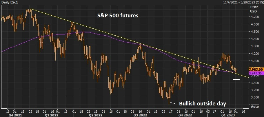
We're revisiting the chart above, from another note of mine last week (Feb 27).
We talked about the technical support in the stock market - this trendline (the yellow line), plus the 200-moving average (the purple line). Both were technical resistance, and since broken in late January, are now support.
Stocks bounced into this support, reversing sharply and we closed the day with a bullish technical signal.
It's hard to see in the chart, but it's an "outside-day." This technical pattern is a very good predictor of tops and bottoms in markets, especially after long, sustained trends. It's driven by an exhaustion of the trend, as the market trades to new lows (in this case) on light volume, and then sharply reverses to close near the highs on high volume (with a range that engulfs the prior day).
As you can also see on the chart, it was an outside-day that marked the bottom of the bear market, back in September.


