With the health crisis, when we wanted to know how things were progressing, we had to ignore the experts and the politicians and look at the data. The data told us the health crisis peaked in April, when the daily change in intubations in New York hospitals started to decline, and soon thereafter, went negative. Something (a treatment) was working. This wasn't going to be another Spanish Flu.
Again, in June, when the experts, the media and the politicians were telling us a second wave was beginning, we looked at the data, and while cases were rising, the deaths relative to cases were falling sharply. The data told us that more aggressive testing was simply revealing the degree of asymptomatics in the population.
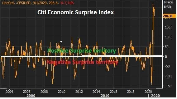
So, just as the data has told the story on the health crisis, the data is also telling the story on the economic crisis. The story is a positive one. Nothing tells the story of reality versus perception like the Citi Economic Surprise index.

You see the big spike at the far right of this chart, above? That reflects the degree to which the expert community has misread the economy, which is a result of misreading the policy response and misreading the health crisis (i.e. they've been dead wrong).
We had another data point to add to this surprise index yesterday, Manufacturing activity for August ran at its hottest levels in late 2018.

This is a story of strong demand, low inventories and production trying to catch up.
That leads to the big inflation theme we've been talking about, that's being reflected in this next chart, the prices paid component of the report. It's aggressively moving higher, and it will continue...


